Gratora provides nine Gutenberg blocks designed for campaign pages. These blocks display live campaign data and let donors take action directly on the page.
How campaign association works
Each campaign block needs to know which campaign it belongs to. There are two ways a block resolves its campaign:
- Page meta: When a block is placed on a campaign’s auto-created page, it reads the
_gratora_campaign_idmeta from that page. No extra configuration is needed. - Explicit campaignId attribute: You can manually set the
campaignIdattribute on any block. This lets you embed campaign blocks on any page, not just the campaign’s own page.
If both are present, the explicit campaignId attribute takes priority.
Adding blocks to a campaign page
- Open the campaign’s linked WordPress page in the block editor.
- Click the + inserter button.
- Search for “Gratora” to see all available campaign blocks.
- Click a block to add it to the page.
Campaign pages come with a starter layout already in place. The standard one is a two-column page: the campaign image, the raised and goal figures, a progress bar, an “About this campaign” section bound to the campaign description, recent donations and top donors down the main column, with a “Donate” heading and the donation form alongside. The other layouts you can pick when you create a campaign arrange the same blocks differently. You can rearrange, remove, or add more blocks as needed.
Campaign image
Block name: gratora/campaign-image
The campaign image block shows the campaign’s cover photo. It follows the campaign rather than the page it sits on, so changing the cover image in the campaign’s settings changes it everywhere the block appears.
Key settings:
campaignId: The campaign to display (auto-detected from page meta if not set)aspectRatio: Wide (16:9), Photo (3:2), Classic (4:3), Square (1:1), or the image’s ownrounded: Rounded cornerspriority: Load with priority. Leave it on when this is the first image a visitor sees, and turn it off further down the page so it loads only when needed
The block settings also carry an image picker, so you can set the campaign’s cover without leaving the page.
Use cases:
- Open a campaign page with the photograph the appeal is about
- Show a specific campaign’s cover on a landing page
Campaign stat
Block name: gratora/campaign-stat
The campaign stat block shows a single campaign figure. Add one per number you want to show, and put them side by side in a columns block for a row of counters. The numbers update as new donations come in.
Key settings:
campaignId: The campaign to display a figure formetric: Amount raised, Our goal, Still needed, Of goal reached, Donations, Donors, Average donation, Top donation, or Days leftlabel: Your own wording under the figure, in place of the metric’s ownsize: Small, medium, or largealign: Left, center, or right
A metric the campaign cannot answer renders nothing: days left needs an end date, goal, still needed and of goal reached all need a goal, and average donation and top donation need at least one donation. The editor says so rather than leaving you a block that disappears on the front end.
Use cases:
- Show social proof by displaying donation activity
- Place near the top of the page so visitors see progress immediately

Campaign progress
Block name: gratora/campaign-progress
The campaign progress block renders a visual progress bar that tracks advancement toward your campaign goal. It works with all three goal types: amount, donations, and donors.
Key settings:
campaignId: The campaign to track progress forshowLabels: Whether to print the raised and target figures beside the baralign: Left or center
If the campaign has no goal set, the bar renders at 0 percent.
Use cases:
- Motivate donors by showing how close the campaign is to its goal
- Pair with the stats block for a complete progress overview

Donate button
Block name: gratora/donate-button
The donate button block displays a call-to-action button that opens the campaign’s donation form in a modal over the page, so a donor never leaves what they were reading.
Key settings:
campaignId: The campaign whose donation form opens when clickedlabel: Button text, defaulting to “Donate now”align: Button alignment (left, center, right)size: Small, medium, or largefullWidth: Stretch the button to the width of its container
The block opens the campaign’s default form when that form is published, and otherwise the campaign’s most recently updated published form. If the campaign has no published form at all, visitors see nothing rather than a button that does not work. Anyone signed in who can edit posts sees a note explaining why.
A campaign that is not taking donations shows the reason in place of the button, so a visitor learns the appeal has finished or has met its goal rather than meeting a button that refuses them.
Use cases:
- Place below the progress bar to encourage immediate action
- Add to any page on your site to drive donations to a specific campaign

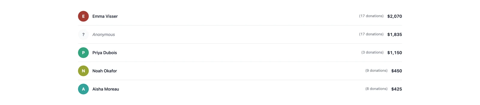
Top donors
Block name: gratora/top-donors
The top donors block displays a leaderboard of your campaign’s top donors, ranked by total donation amount. It highlights your most generous supporters.
Key settings:
campaignId: The campaign to show top donors forlimit: How many donors to listlayout: List or podium- Toggles for the donation amount, the donation count per donor, and whether to hide anonymous donors
titleandemptyText: Optional heading, and the text shown before there is anything to list
Use cases:
- Encourage larger donations through friendly competition
- Recognize and thank your biggest supporters publicly
Recent donations
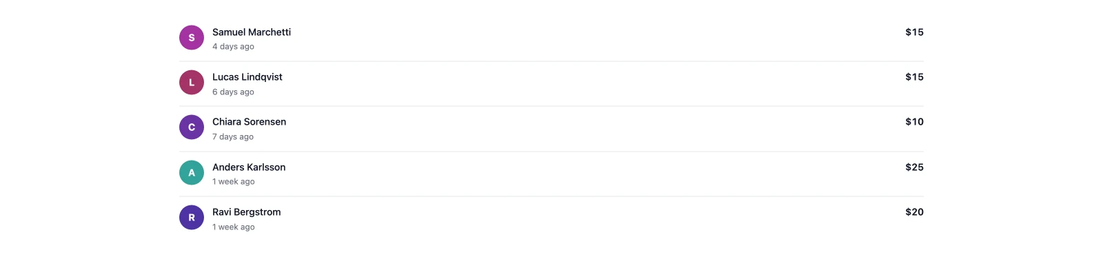
Block name: gratora/recent-donations
The recent donations block shows a feed of the most recent paid donations to your campaign. It creates a sense of momentum and activity.
Key settings:
campaignId: The campaign to show recent donations forlimit: How many donations to list- Toggles for the amount, the time, the donor’s message, and whether anonymous donations appear
titleandemptyText: Optional heading, and the text shown before there is anything to list
Use cases:
- Build urgency and social proof with real-time donation activity
- Show visitors that others are actively supporting the cause
Supporter wall
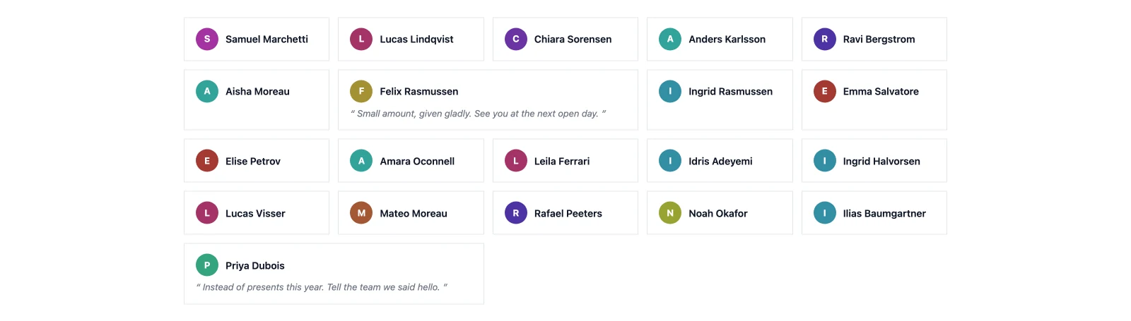
Block name: gratora/supporter-wall
The supporter wall block displays a grid of supporter cards, each with an initial avatar and the supporter’s name. It creates a visual community of everyone who has donated to the campaign. There is one card per donor however many times they gave, and anonymous donations are never shown.
Key settings:
campaignId: The campaign to show supporters forlimit: How many supporters to showsort: Most recent or alphabeticalcolumns: Auto, 2, 3, or 4- A minimum amount, so only supporters who gave at least that much appear
- Toggles for the supporter’s message and the amount given
Use cases:
- Celebrate your donor community with a visual display
- Encourage new donors to join by showing how many people have already given
Donation form
Block name: gratora/donation-form
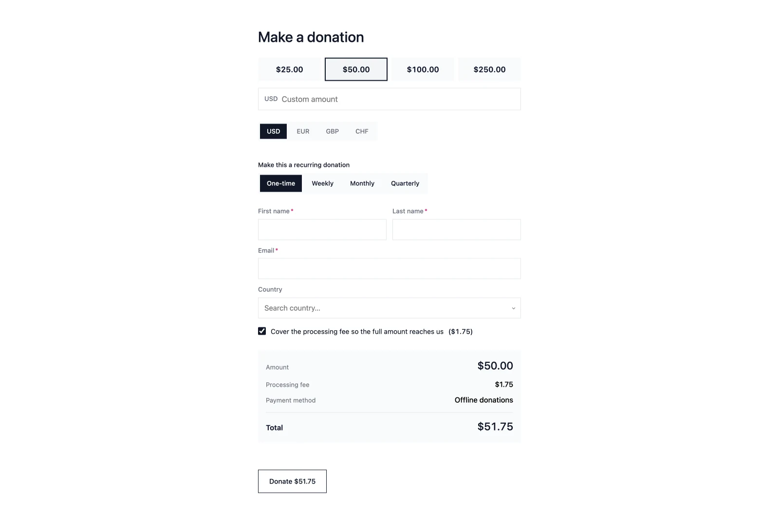
The donation form block renders the campaign’s donation form inline on the page, so donors can give without leaving it. The seeded campaign layout places it in the sidebar column. It picks the same form as the donate button: the campaign’s default form when published, otherwise the campaign’s most recently updated published form.
Key settings:
campaignId: The campaign whose form is renderedemptyText: What to show when there is no published form, or the campaign is not taking donations, so a heading above the block never captions an empty space
Use cases:
- Keep giving on the campaign page itself rather than behind a button
- Embed a specific campaign’s form on any other page
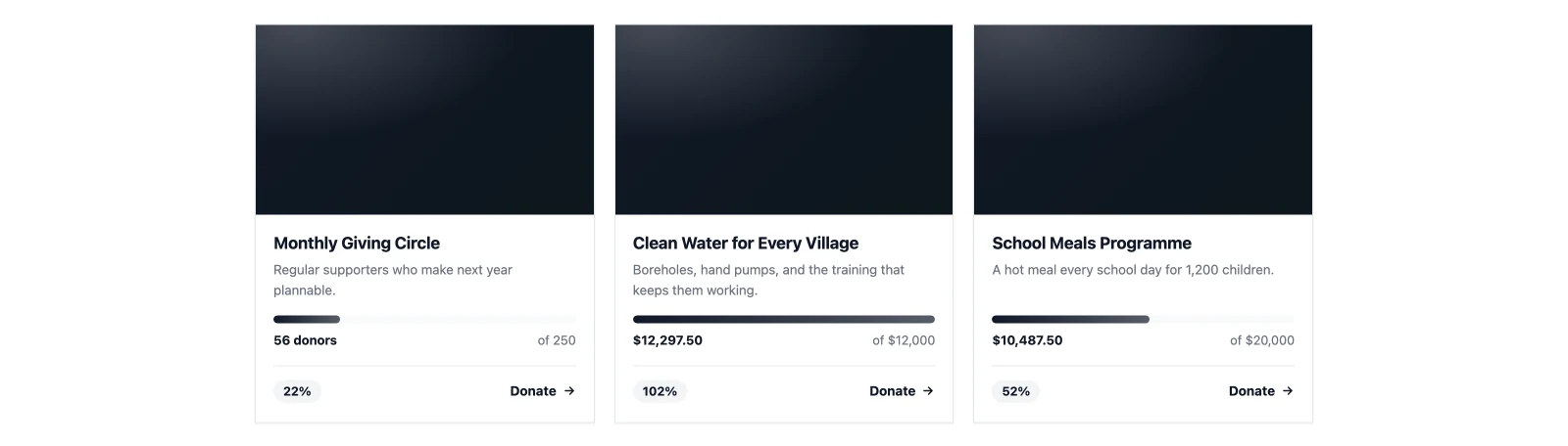
Campaigns grid
Block name: gratora/campaign-grid
The campaigns grid block shows a responsive grid of your other published campaigns as cards. The campaign the page is about is excluded from its own grid.
Key settings:
campaignId: The campaign to exclude (auto-detected from page meta if not set)count: How many campaigns to showorderBy: Most recent, most funded, or ending soonheadingandemptyText: Optional heading, and the text shown when there is nothing to list
Use cases:
- Send visitors on to your other campaigns from the bottom of a campaign page
- Build a simple “all campaigns” page anywhere on your site